
SHUKI
Cycle tracking and future prediction
Access to a large content library
Get in touch with experts
My role on this project
UX research and design
UI design
Tools


About Shuki
The word "Shuki" means cycle in Japanese. The app helps women take control of their cycle by providing support to ensure they get better understanding of their reproductive health no matter what life stage they are at.
Created during a 6 months online UX specialisation course. I chose to work on a health related app, and selected a topic that I am passionate about. As a user I have noticed a gap on the available market.
01
Research
Analysing the existing market to ensure Shuki meets user needs and goals.
Get a good overview of the current tracking apps.
User interviews and surveys helped to determine the key features of the app and build relevant personas.

Competitor analysis


Available apps have an amazing selection of tracking, pregnancy features; a great content library that is available only to users that have purchased a membership.
An SWOT analysis, helped me realise that some features can be added on this apps to ensure user get the best experience.
Conclusion
Get a larger selection of content type to educate user as much as possible
Include more symptoms log options for people with conditions or issues to feel included
Connect user with experts to ensure they get the best advise possible following their needs
Offer the opportunity for users to share profiles, content with family and friend
User stories
I want to search for a specific symptom, I want to be able to filter content so I can search for my symptom and get better understanding of my body
I want to be able to get information on symptoms, so I get better understanding of it and improve my well-being
I want to get a tracking feature, so I can know where I am at in my cycle on a daily basis
I want to have access to reports/graphs on my cycle so I can show it to my health practician if needed
Problem statement
Many women are lacking knowledge on their reproductive health and feels that it is a topic they can’t discuss openly.
Solution
Provide a platform and tools where women can keep on top of their reproductive health as well as getting support and information whenever they need.
User research
To get better understanding of my users I have interviewed 3 women and collected data from 45 other worldwide to understand what behaviour, relationship and expectations they have when it come to their reproductive health.
Survey and interview insight
1
Different methods are used by participants to track their cycle but a higher % use phone app
2
Main reason for tracking their cycle: Get better understanding of
their body and cycle
3
Participants want to have access to helpful and educational content
4
More than half of women interviewed track their cycle only when they need to prepared
Personas

Olivia is 32 years old and currently works part time for a law firm in London as she recently had a baby.
She enjoys spending time with her family and walk in Richmond park when it is sunny.
Olivia is still breastfeeding and her cycle is not back to pre partum.
Olivia said:
“I would like to have access to a database of competent health professionals close to me”
Needs & Goals
Olivia need an app to track the different stages of her reproductive journey and access content related to motherhood, nutrition and fitness
Motivations
Olivia wants to be prepared for when she gets pregnant in the future and have better knowledge of her body, hormones and cycle.
Frustrations
Olivia feels that sometimes specialists are under pressure and don’t have time to answer her questions
Behaviour
Olivia shares her experience and knowledge on reproductive health with friends and family.
She likes to search for content and health information online.
Olivia schedules workout at least 3 times a week.

Becca is 30 years old , she is a chef in a bog restaurant in London and recently got married.
She has been diagnosed with endometriosis 5 years ago. She shares her journey on a blog to create awareness.
She is passionate about food and loves cooking for others and she practices yoga and meditation as it helps her with pain management
Becca said:
“ I don’t plan important things on the week of my periods ”
Behaviour
Becca tracks her cycle everyday to stay on top of her endometriosis
She shares her experience on a blog to create awareness
Due to her disorder she has to do a lot of research online
Frustrations
Apps don’t have enough data tracking options for her to accurate prediction on her cycle
Many times she felt that specialists wouldn’t listen to her symptoms and she didn’t felt that she could talk freely
Motivations
Becca wants to take an holistic approach to heal her endometriosis. She wants to get better without getting surgery or taking hormonal treatment
She wants to find the best experts from her home
Needs & Goals
An app to track her symptoms, pain, sleep, food and water intake etc…
That will provide her with holistic alternatives for her illness and find experts that are specialised in endometriosis.
02
Architectural information

This step of the process was designed to understand how the user interacts with the labelling, navigation and search systems of the app and ensure selected features are relevant.
Following the results, design alterations were made.
Sitemap

Mid fidelity wireframe

User testing
During the process, 4 women have been asked to perform 4 tasks on a mid-fidelity prototype to see if the different user flows were clear and relevant to the users.
What went well?
All participants found registration process simple and quick
All participants navigated through the app easily
All participants felt that the app was relevant to their needs
What went wrong?
3 out of 4 participants didn’t understand that during the registration process, in the interests section, they could choose multiple options
Users didn’t see the map
functionality on the experts page
All participants didn’t know what the reminders would be for and if she would use it.
Participants with condition didn't feel included.
3 out of 4 participants felt confused about terminology used on the app
Solutions
1
Add some introduction copy in the registration process
2
Remove reminders step from registration process.
Incorporate a step asking user about any health condition
3
Change some of the terminology on the app
4
Rework map position on expert page to make it more visible
Dashboard
Refining the design
Following the user testing and very valuable feedback received, I have made a few changes to the app to ensure all functionalities and user journey were relevant to the user needs.


1
Overview: the user will be able to have a quick summary of the current cycle.
Today’s date also has been added so user doesn’t get confused
2
Cycle log: A new lifestyle category has been added with new options for more accurate tracking. The 2 categories will be done as dropdown to ensure the dashboard isn’t too long and the user doesn’t have to scroll
3
Cycle history will display the previous cycle length, basal temperature and a calendar showcasing all different symptoms logged previously (a “month” CTA will allow the user to see previous data logged).
Preference testing
To refine Shuki design and ensure the app is matching user expectations, a A/B testing was done. Accessibility was also checked an amended following the WCAG recommandations.
Version A
Version B

A few participants mentioned during the usability test that they don’t enjoy providing personal information at all time.
One of the participant even said that she will delete an app if she feel like it is asking personal information like her date of birth.
Incorporating quick registration process with other app or account could help user feel more comfortable. This option also remove the annoying part of typing over and over the same information.
80% of the participants prefer the version B as “it looks more simple”, “Less information to fill”
Version A
Version B

As part of the registration process, a series of 4 questions is being asked to the user to ensure the app is tailored to their needs.
65% of participants prefer the variation A as they can see how many steps is the process “ I like the numbers on top, which makes the progression very visual and concrete”.

Expert page
1
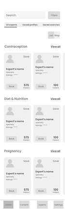
The map feature has been made more visible to ensure the user can view results on it when needed.
2
More information have been added onto each expert card to help easier and faster search
03
Visual
design

Style guide
Available apps on the market use mainly pink and red as primary colours. To ensure Shuki stands out from the competition, a panel of bright colours inspired from the 70's have been chosen.
Minimalist fonts identical to the one used on Apple branding, help provide a modern touch.
A fun and dynamic side is showcase through colourful illustrations.
The profile images of experts were chosen due to their positive disposition which is designed to increase the feeling of trustworthiness by the user.
Fonts

Icons
Colours
#041983
#FA7896
#F39B9B
#F39A62
#EBC23B
#62B4B2
#6BA0A8
#707070
#EEEEEE
Illustrations


UI elements


Final designs
Registration process


Before the user can use the app, a few quick registration questions are asked to ensure the correct information and relevant content are displayed. This will also tailor the
homepage to the user needs
Dashboard
& symptoms log


Article page
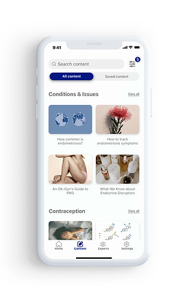


The user can have access to thousands of articles, videos, podcasts created by experts.
The articles are display by categories and can be saved to read later or filters.
A search bar is located at the top to search for words, content, topics etc
Experts page
The user can access a large expert database and book appointment directly on the app.
Each expert has a profile page that can be save or share by the user in the kebab menu.
About the expert, specialisation categories provide the user with all the relevant information about the expert.
Articles or videos published by the expert will also be displayed and accessible from this page.


Conclusion
1
I have manage to develop Shuki further than I initially planned and hoped.
The preference and user testing of the app as well as collaborations with other students helped foster new ideas and improve the user experience and interface
2
Developing Shuki as a standalone project in isolation was challenging as I did not have a project team to exchange ideas and collaborate more closely.
3
If I had to start over, I would spend more time developing the UI aspect of the project in more detail. I would invest on getting illustrations, logo and icons professionally design to align more closely with the brand objectives.

Check out my latest work

UI Project
Fitto - Responsive app
Fitto is an app that help users stay motivated onto a daily exercise routine with dynamic and fun workouts

Graphic design
Retro Branding
Discover Retro, the homeware brand located in the heart of trendy James Street. This fictive brand is inspired by the Bauhaus movement, and invites you to discover a colourful and unique universe.

Ux Project
Shuki - Native app
Shuki is an app that helps women take control of their cycle by providing support to ensure they get better understanding of their reproductive health

Graphic design
RS Chocolaterie
Chocolate truck concept located in suburbs of Paris and created by Romu Sadoine in 2020