About Sleep Well
Sleep Well is a project that I created in just one day for an interview. The colour palette and fonts were set by the company.
Using Figma, I decided to go for a minimalist approach to promote a sense of tranquility and relaxation, which is exactly what the product is designed to do. I made sure to highlight the scientific features of the product to help users understand the benefits of the supplement. By doing so, users can make an informed decision about whether or not product is right for them. The overall tone of the project is professional and informative, which is important when promoting a product..
PROJECT
PROJECT
Colours Palette & Fonts
This color palette draws inspiration from the tranquility and healing power of nature, perfectly complementing themes of natural remedy, health, science, and sleep.
The deep, Moss Green symbolises the grounding and restorative qualities found in nature, a sense of calm and balance.
The warm, soothing tones of Buttercup and Snow reflect the gentle touch of sunlight and the comfort of healing therapies, fostering a sense of well-being and serenity.
Finally, the muted olive green Sage connects to the scientific exploration of herbal remedies, emphasising a holistic approach to health and wellness. This harmonious palette creates an environment that encourages restful sleep and rejuvenation, aligning with the principles of natural and scientific healing.


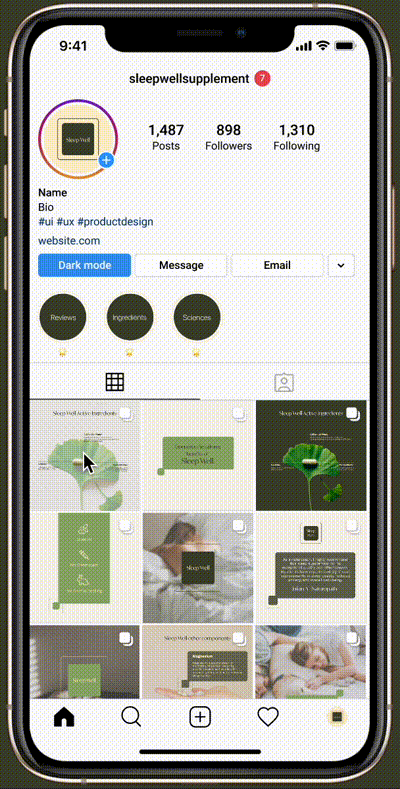
How Sleep Well looks on socials
By using the design of the product page as the main reference for social media, it will create consistency for the brand across various platforms and ensure user recognition. By maintaining a consistent look and feel, customers will be able to easily recognise Sleep Well brand and products, no matter where they encounter them. This can help to build trust and loyalty with the audience.